Beastie Boys
CONCEPT: How a distinct cultural identity could be interpreted through physical products, by translating spirit and attitude into tangible experiences.
Across two releases, Sabotage and Intergalactic, I approached the Beastie Boys with narrative illustration and unique packaging in mind. Each project was developed to honor the original material while offering fans something new and special.
Sabotage — Narrative Illustration & Art Direction
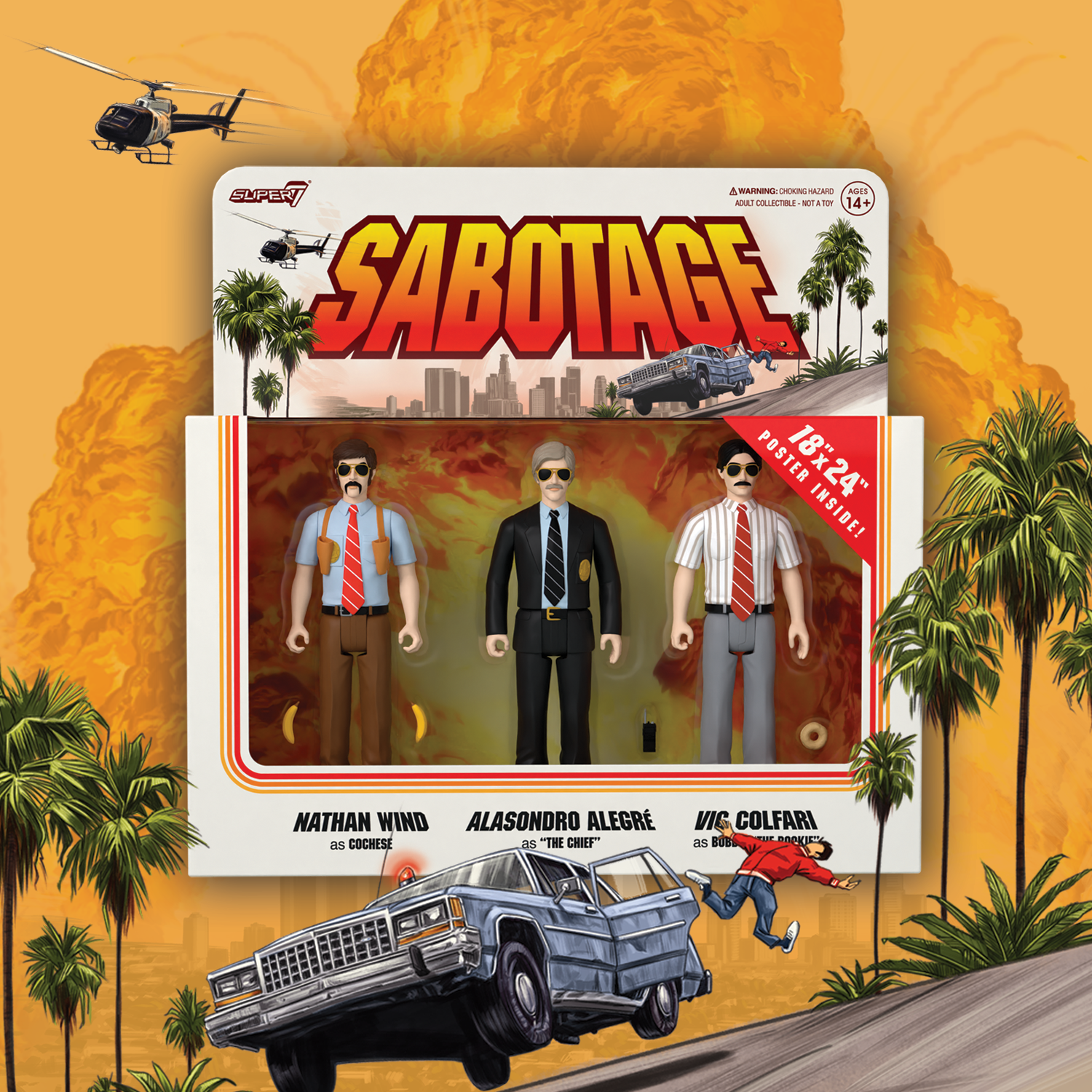
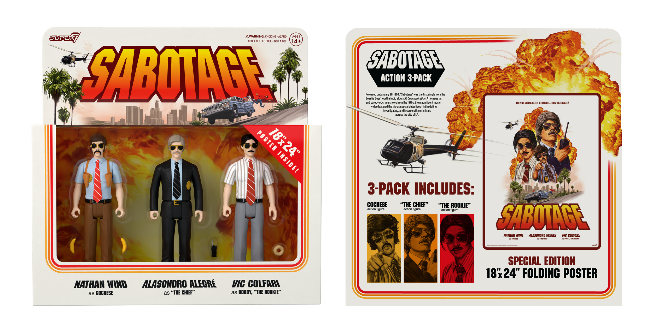
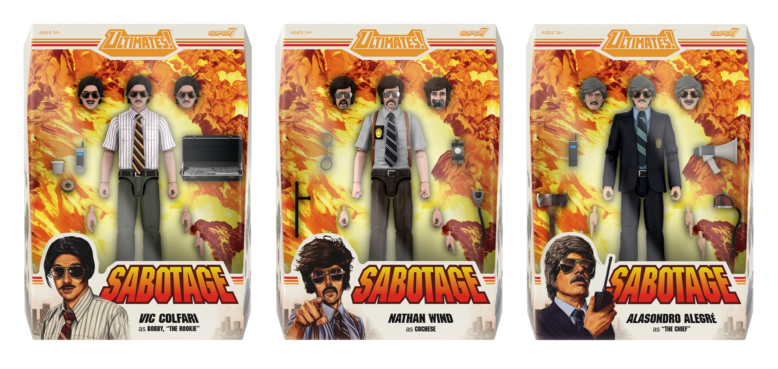
The Sabotage release was conceived as a graphic tribute to the chaos, satire, and aggression of the song and music video. Drawing inspiration from 1970s crime dramas and vintage cop film posters, the concept called for the larger-than-life music video characters towering over the LA landscape, explosions and all.
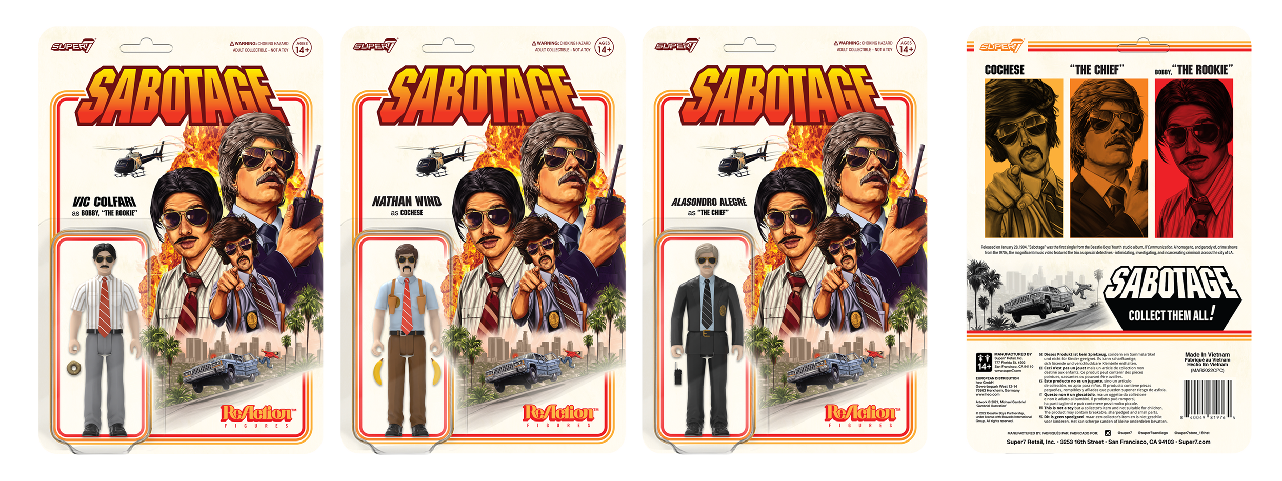
I developed the creative concept and design brief, then art directed illustrator Michael Gambriel to execute the final piece. My role focused on aligning narrative tone, energy, and composition, ensuring the final illustration could be used seamlessly across every product category and use case.
Intergalactic — Packaging as Experience
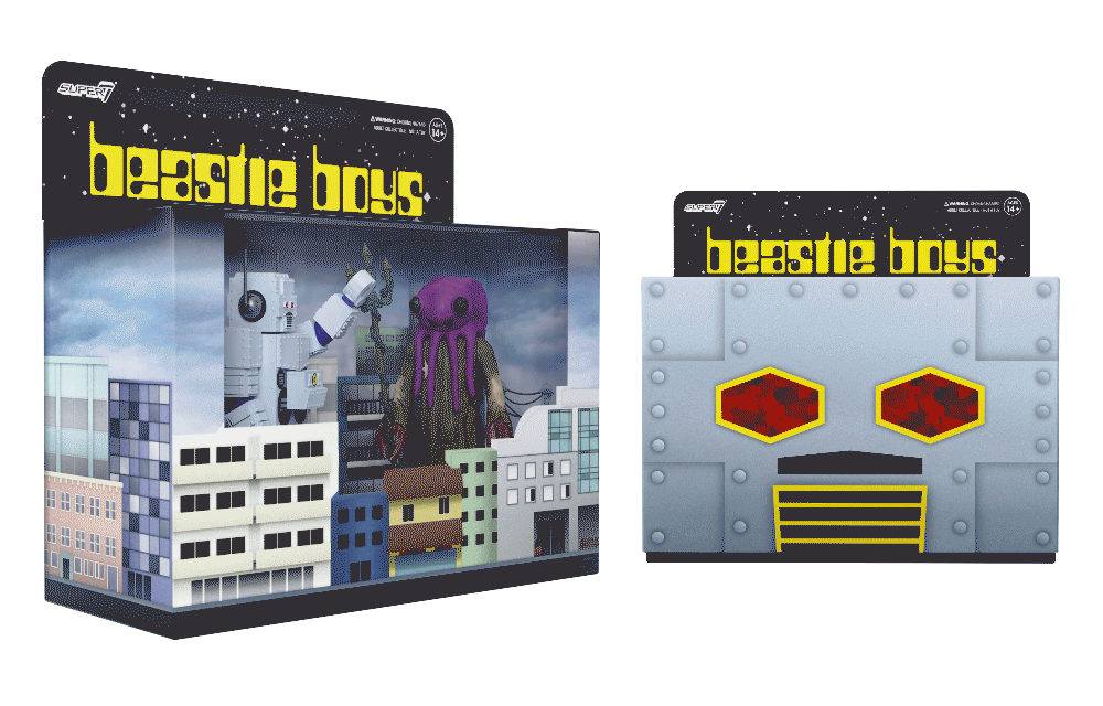
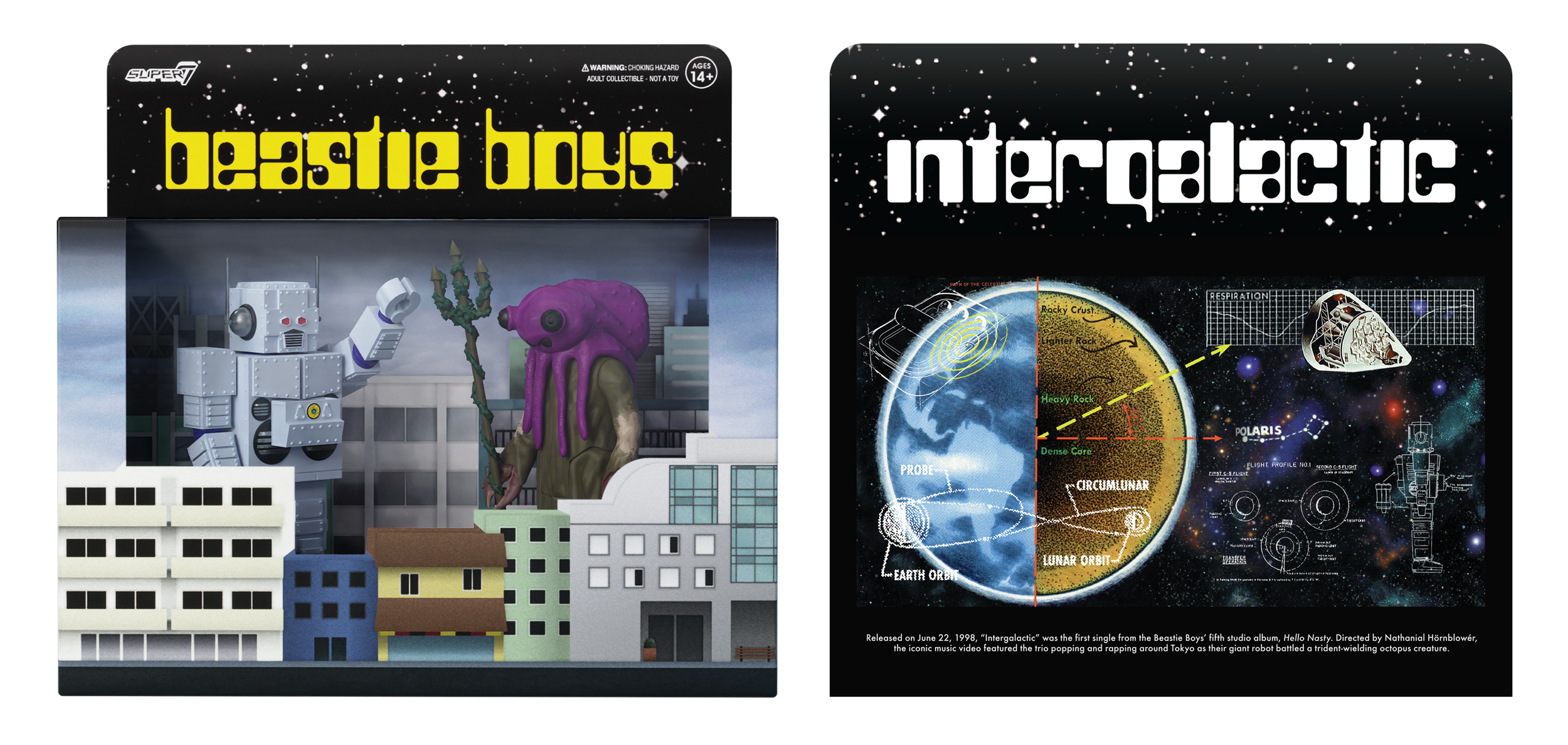
Rather than relying on illustration alone, the packaging for Intergalactic was made to function as a diorama inspired by the energetic music video and the miniaturized Japan seen in it.
The outer sleeve depicted the Giant Robot’s head and, when removed, revealed the diorama and the two figures (Giant Robot and Squid Monster) fighting inside.
CONCLUSION: Together, these projects demonstrate how I approach culturally significant IP: by listening closely to its voice and translating that identity into products that feel authored, true, and alive. Whether through narrative illustration or unique packaging, the goal was to preserve the essence of the Beastie Boys while offering new ways for fans to experience it.

They're gonna set it straight...
The final illustrated piece, inspired by explosive 70s crime dramas, and designed as a large-format poster. The artist was directed to provide their digital art in layers to allow for modularity and to easily translate the art to other releases.
This Watergate!
This project started with ReAction cardbacks and successfully shifted to other product formats by using the intentionally modular illustration.

Crystal Clear
Style inspiration, composition, and specific reference notes were provided to the illustrator before the project began.

Rough Composition
Using an already established ReAction cardback system, this preliminary composition laid out how I saw the placement of the characters and elements.

Details
Specific details, such as the Crown Victoria and ragdoll used during the action scenes, were hand-picked to stay true to the narrative and provide fun details for collectors.


Gonna shine like a sunbeam
The Intergalactic packaging featured PMS and spot gloss callouts, with an additional red foil for the sleeve to bring the Giant Robot’s eyes to life.
Another Dimension
Front diorama window and back of the packaging shown here. The back of the box featured space-themed licensor art.