Pee-Wee's Playhouse
CONCEPT: How to build packaging systems that are tailored to the unique visual language of an IP.
This project explored how I applied the distinct and quirky visual identity of Pee-wee’s Playhouse to two different product lines.
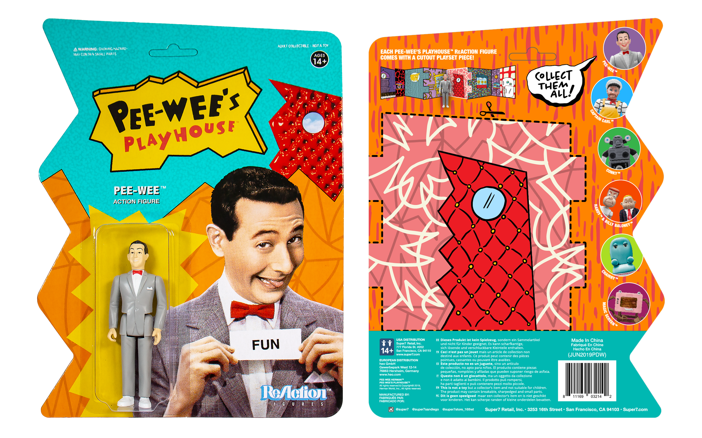
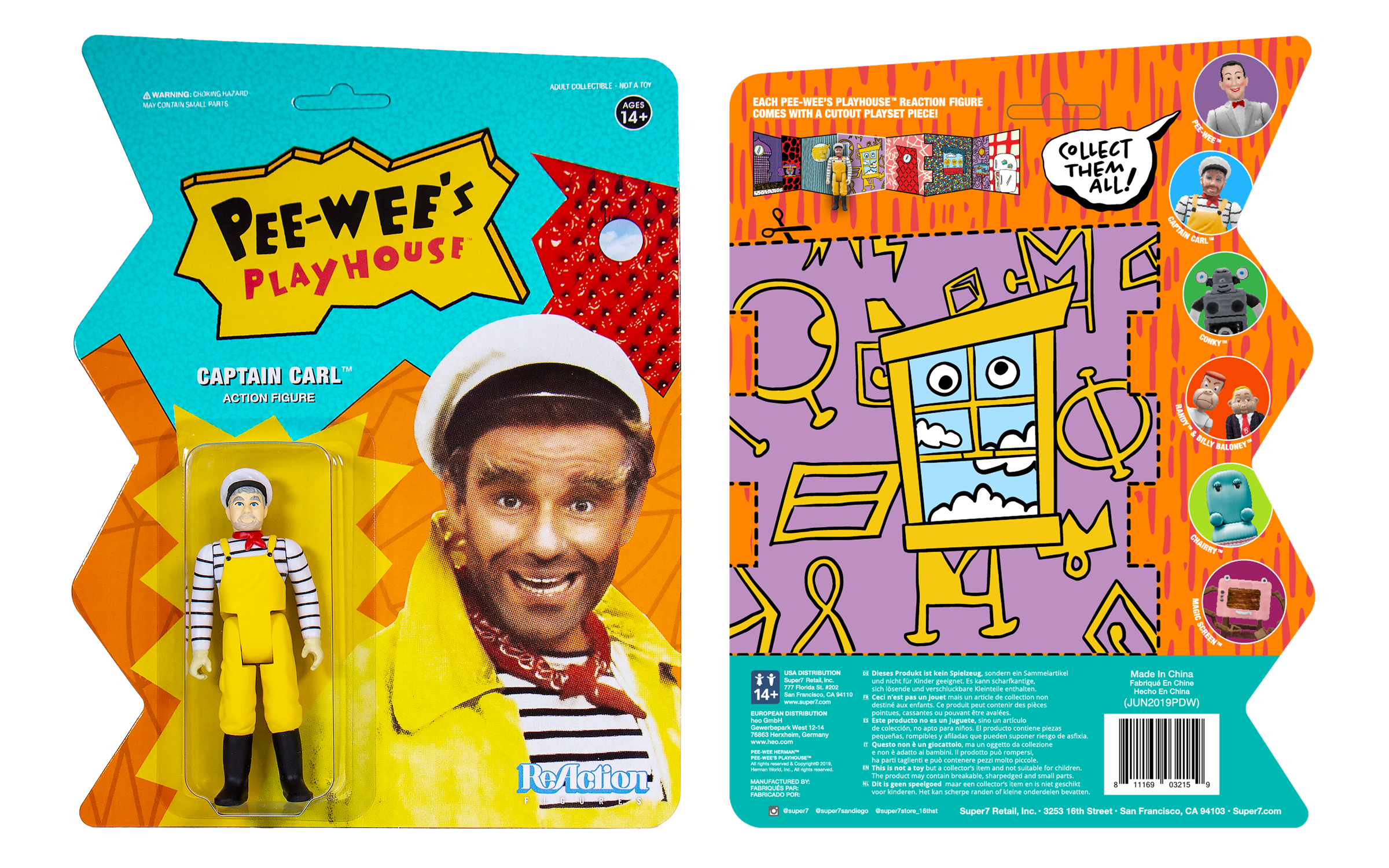
ReAction Figures: The Secret Word is…
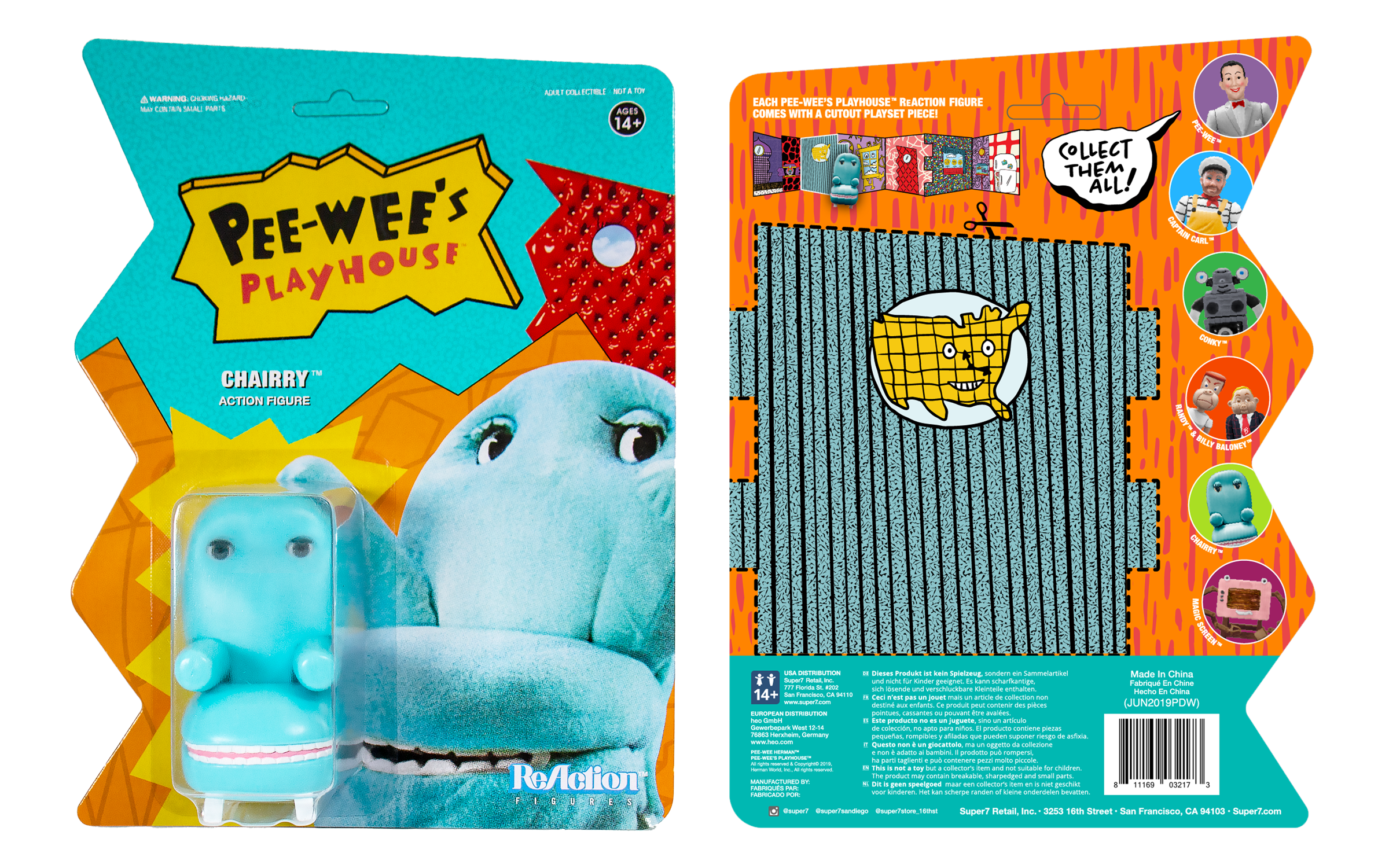
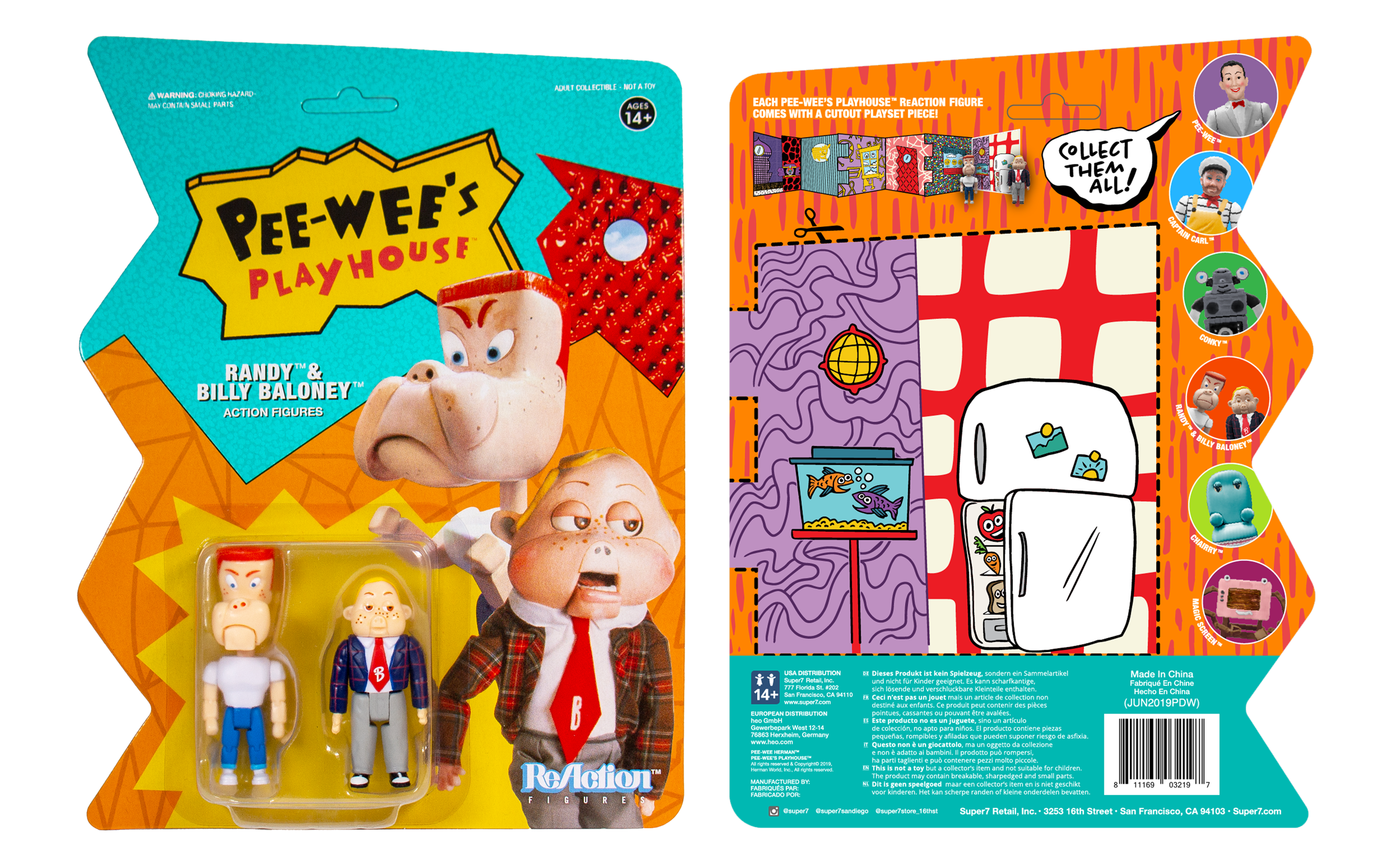
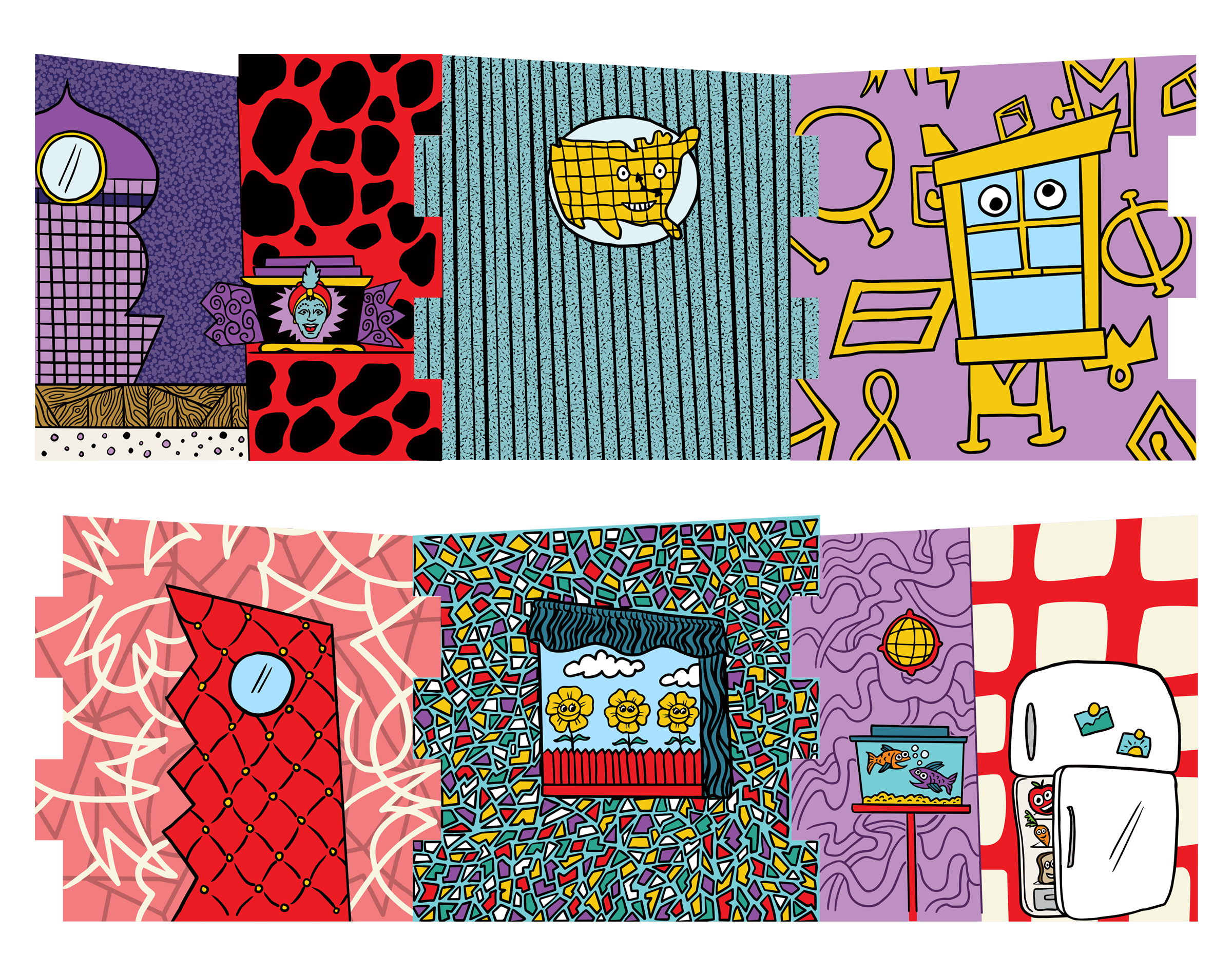
The first release for Super7’s line of Pee-wee collectibles took inspiration from the exaggerated and over-the-top styling and characters from the show. I designed a uniquely-shaped cardback inspired by the playhouse’s front door and established a visual system full of bold colors and wonky shapes. These ReAction figure cardbacks also included the novelty of a build-your-own playset.
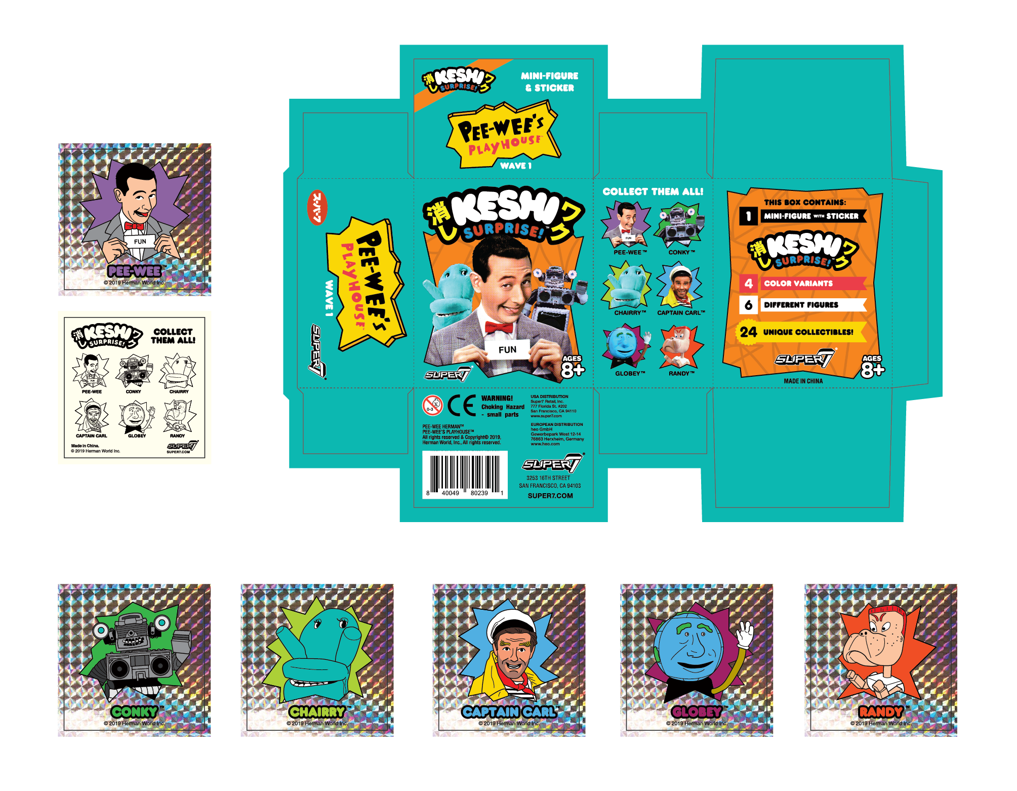
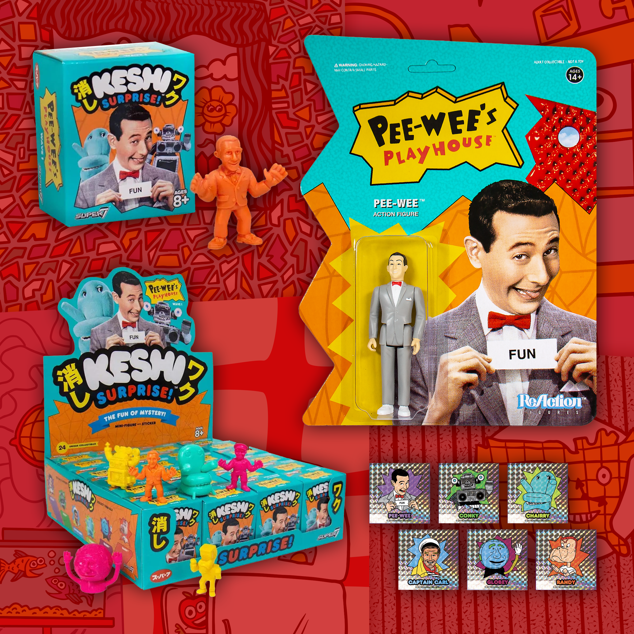
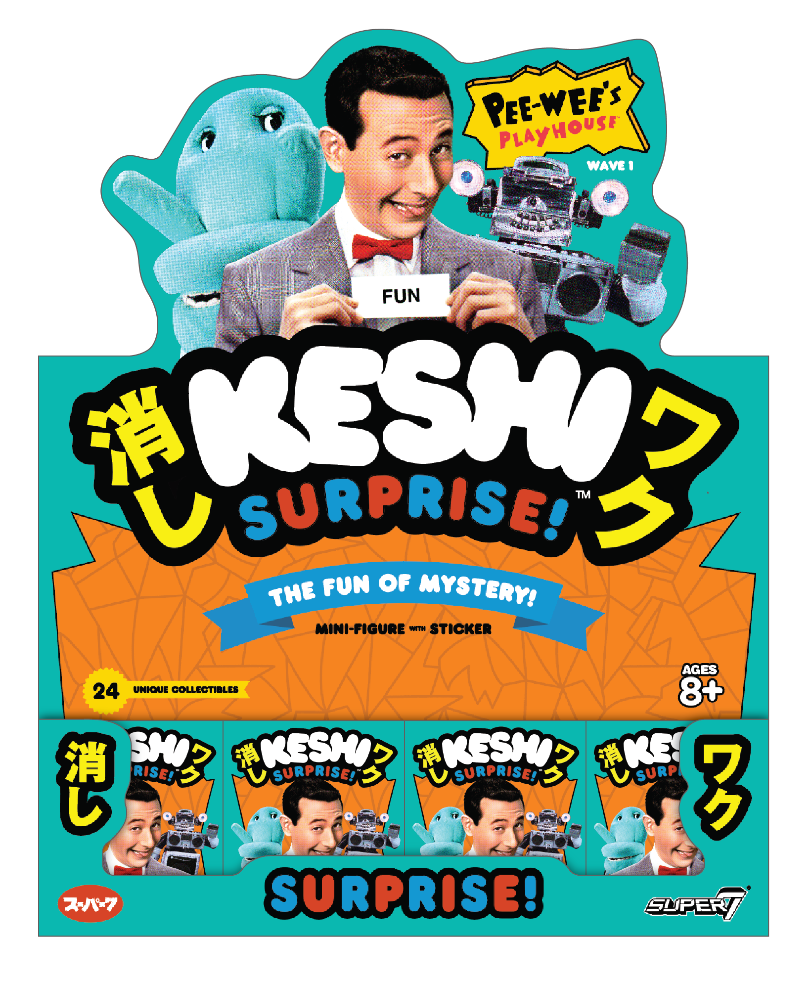
Keshi Surprise: FUN!
The Keshi Surprise Blind Box and PDQ built upon the visual standard set by the ReAction figures, utilizing familiar colors and imagery to maintain product cohesion. Additional illustrations were created for use on the holographic stickers included with each mini-figure.
CONCLUSION: This project demonstrates how a unique visual language can be translated into cohesive and amusing packaging across two different product lines.
That's my name, don't wear it out!
The unique shape, bold colors, and eclectic element placement found on the cardback were inspired by the set of Pee-wee’s Playhouse as well as vintage Pee-wee collectibles.


Why don't you make me?
When cut out, the illustrations on the back of each cardback connected to create a ReAction figure backdrop.
Keshi Surprise!
Mockup of the PDQ that housed the individual mini-figure blind-boxes. Each of the 6 characters came with their own unique holographic sticker.