Godzilla Station
CONCEPT: How graphic systems and branding can transform retail into an immersive, story-driven space.
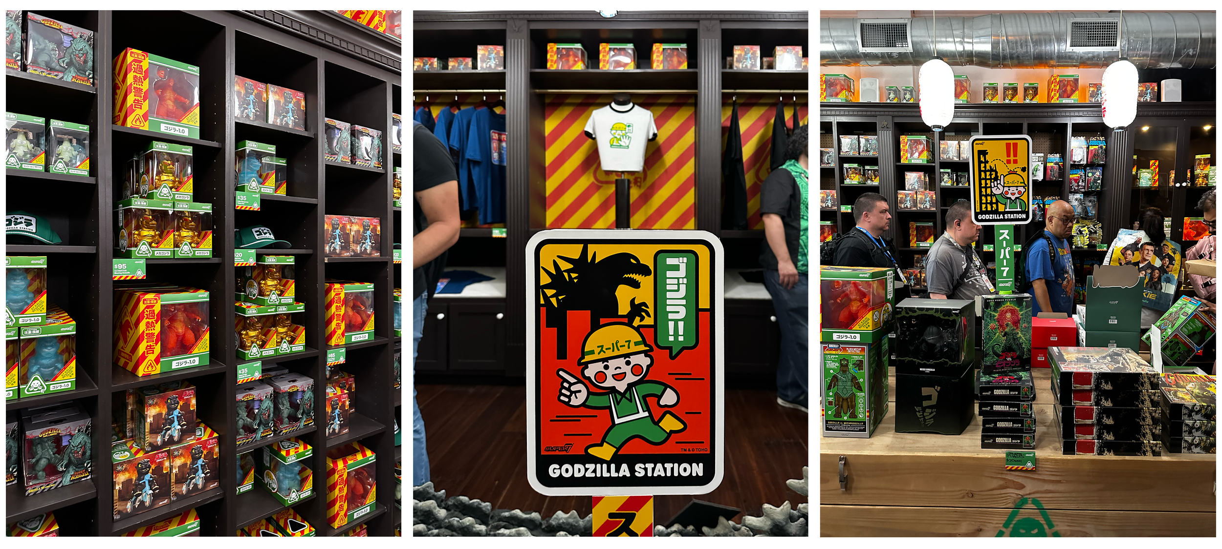
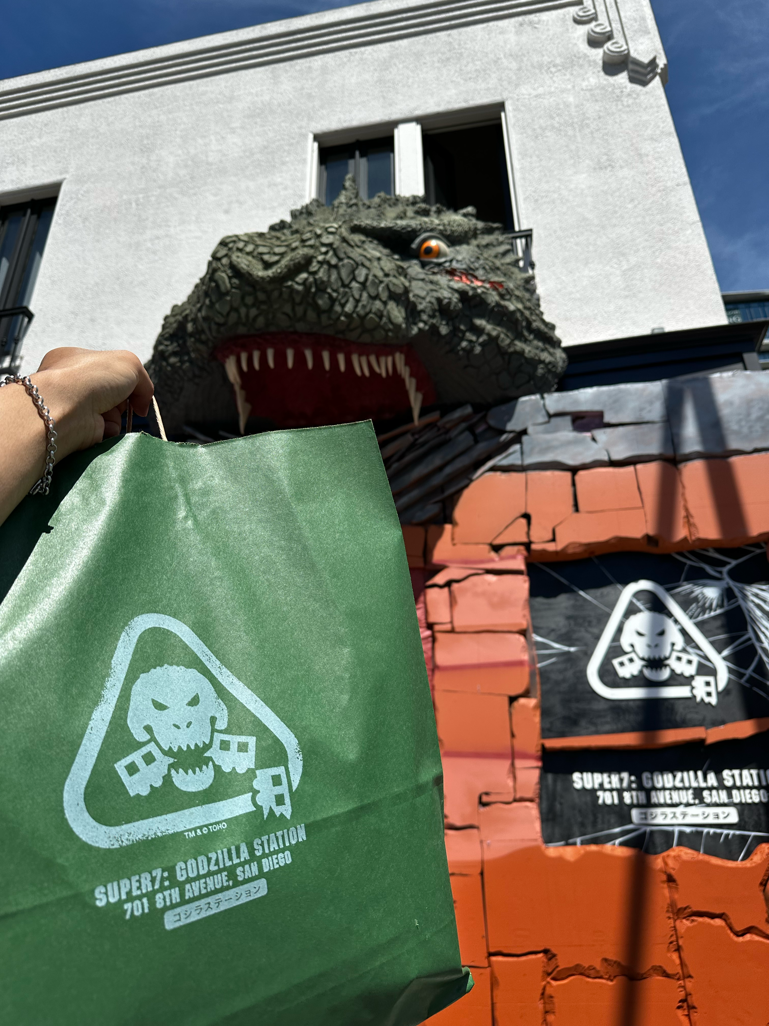
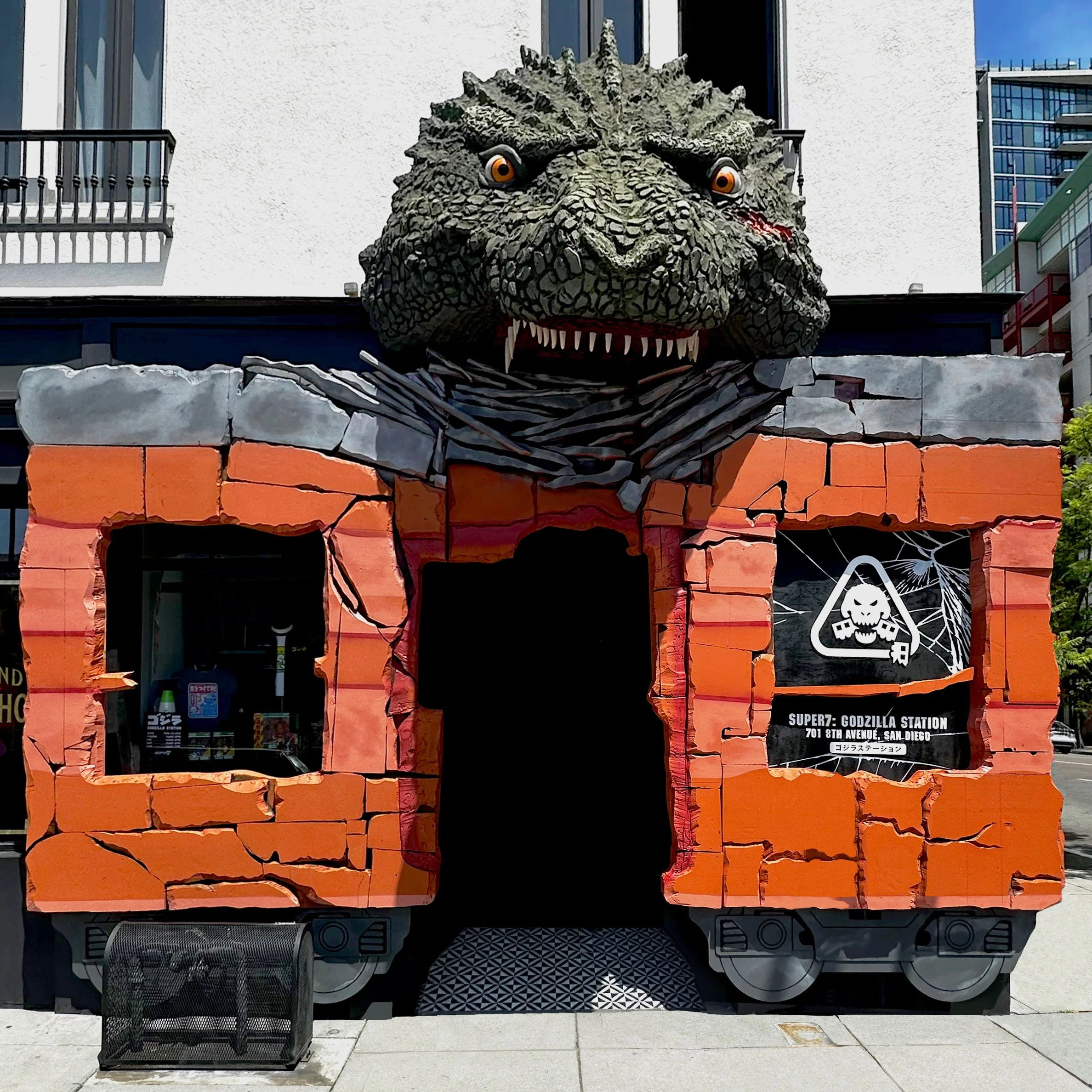
Godzilla Station was a San Diego Comic-Con pop-up designed as an immersive retail environment. The event took place at Super7 San Diego and reimagined the store as a subway station damaged by Godzilla.
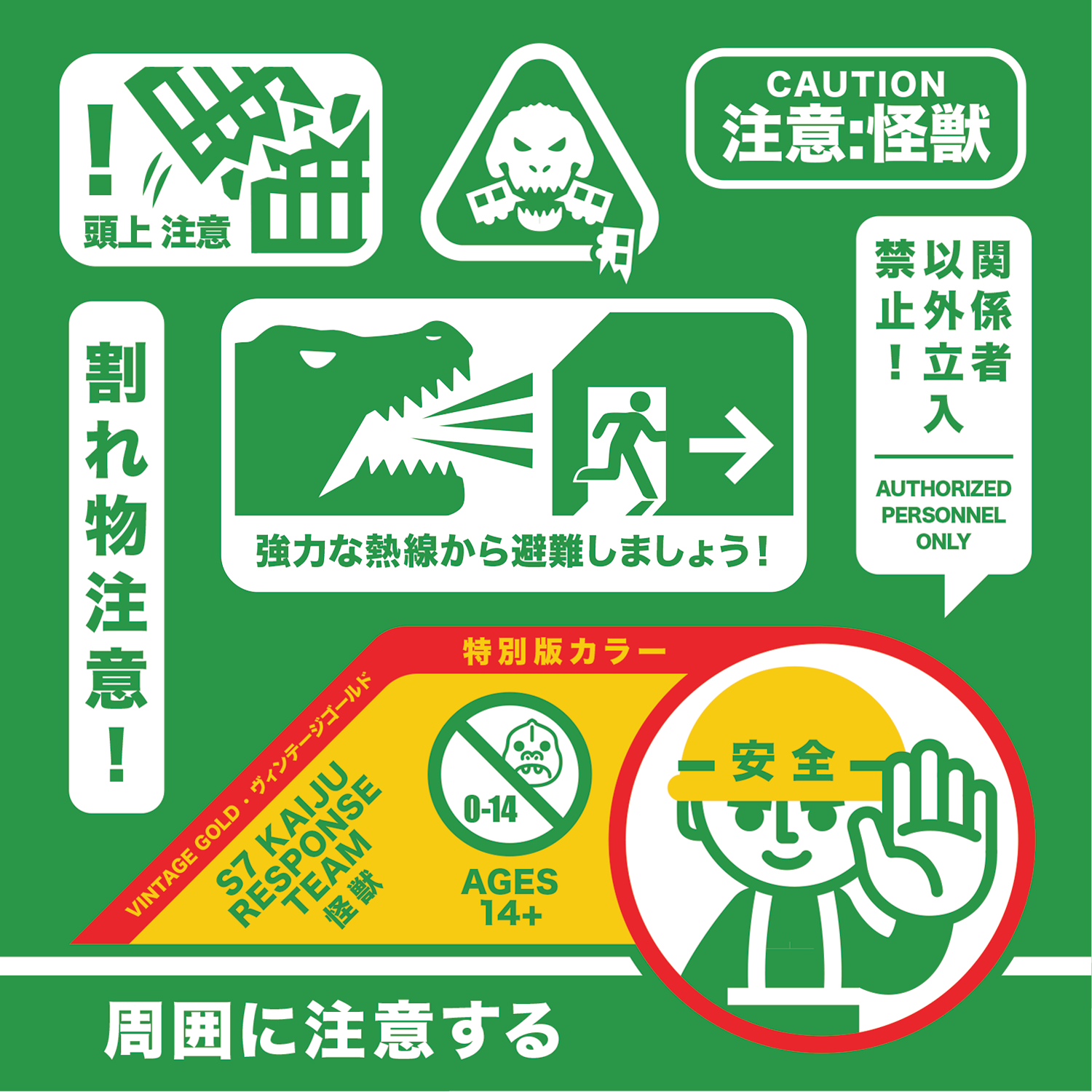
I developed the visual identity for the experience, including the logo, illustration system, color palette, and packaging language used across the pop-up. Inspired by Japanese subway signage and construction warning graphics, the design combined bold utility with playful energy.
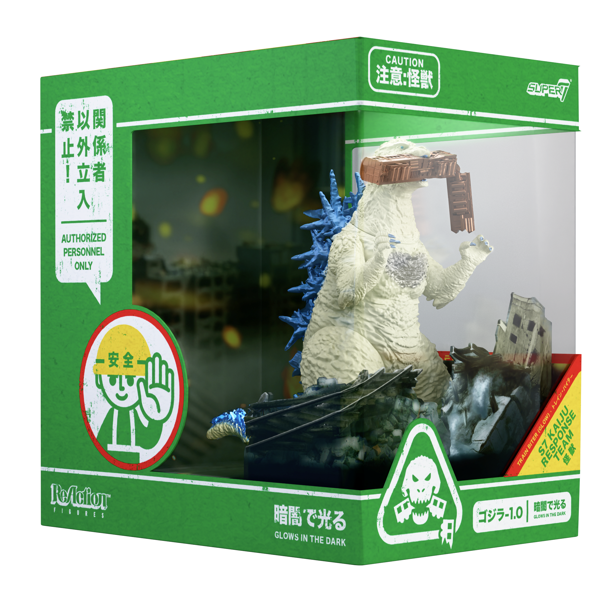
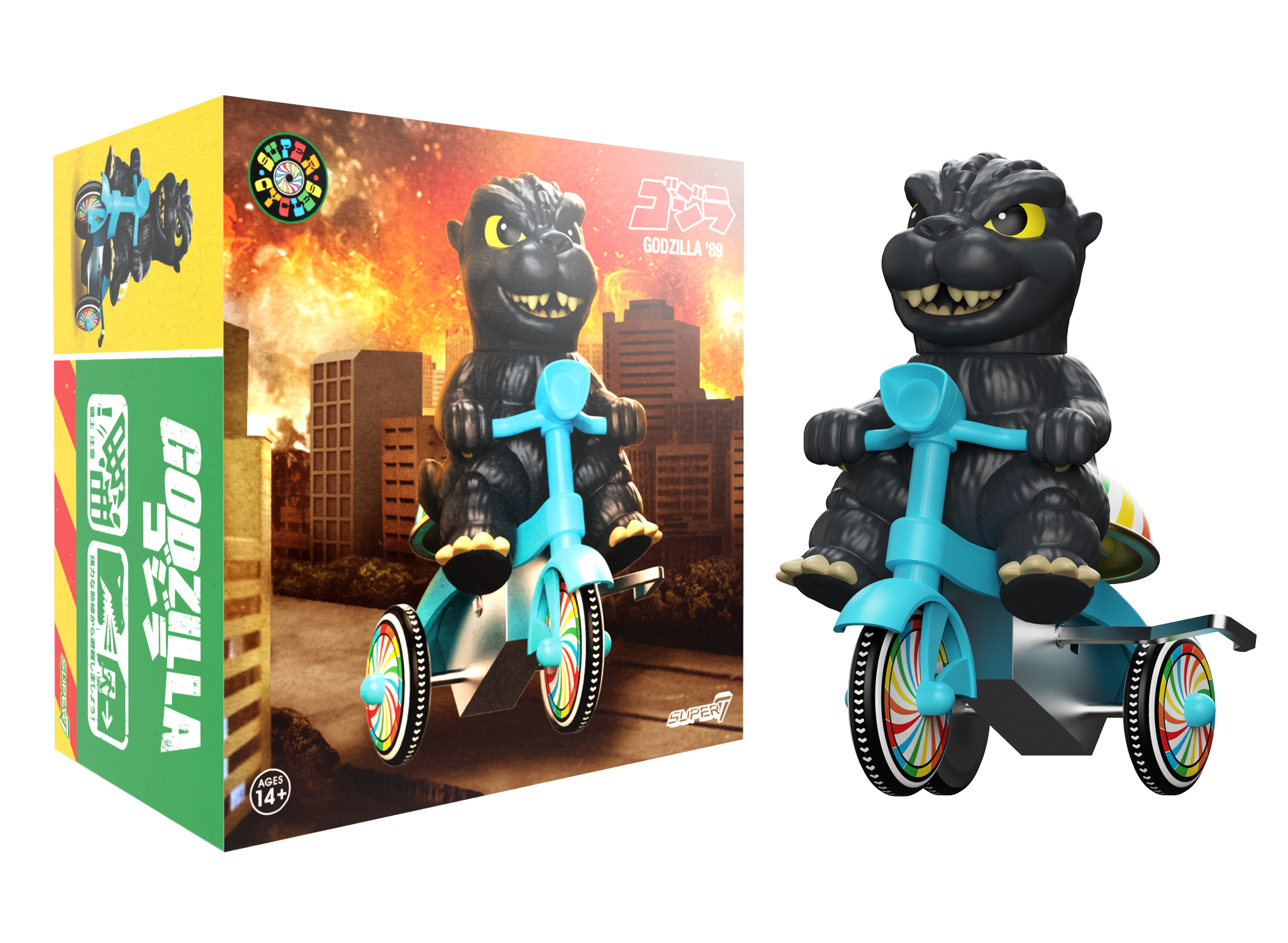
The graphic system extended across packaging and product presentation, establishing a consistent look and feel for the products sold at the pop-up. The illustrations and color standards created for Godzilla Station also became the visual foundation for additional signage throughout the space.
CONCLUSION: This project demonstrates how graphic systems can do more than decorate retail, and how they can define place, guide experience, and unify product, space, and story.
Kaiju Response Team
This custom logo was used across packaging and products for the special pop-up.
Authorized Personnel Only
Spot illustrations and warnings were designed to be visually striking, yet fun and playful.

Kaiju Response Team
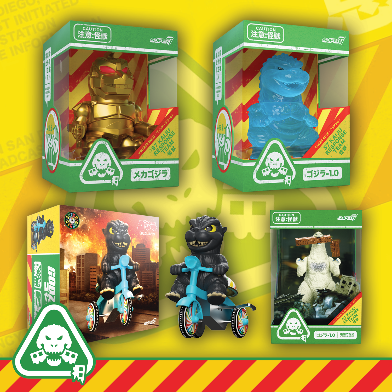
Packaging system for Super7 Fun! Fun! figures (as well as the other packaging in the collection) featured simulated wear to lean into the world destroyed by Godzilla.

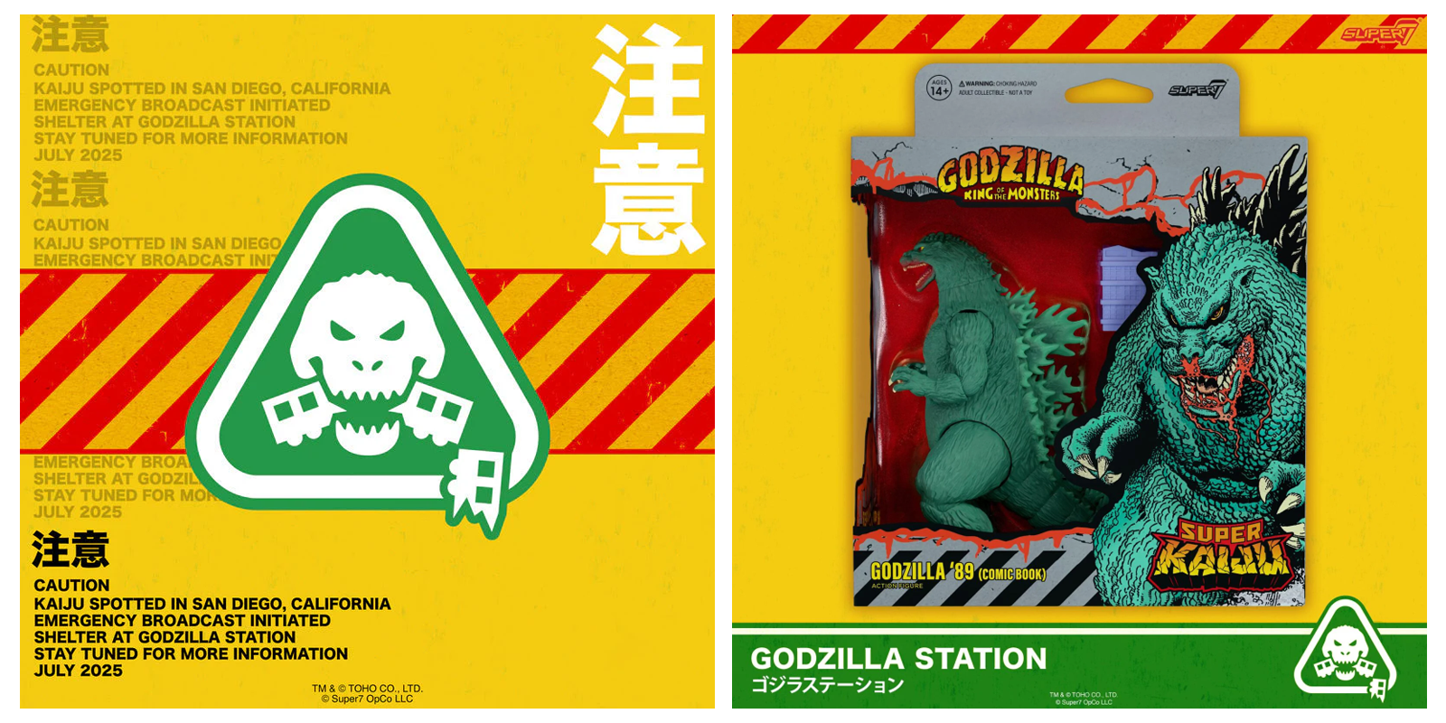
Emergency Broadcast
Miscellaneous marketing imagery using the graphic system.
Godzilla Station
Exterior and interior shots of the Godzilla Station Pop Up.