Who Framed Roger Rabbit?
CONCEPT: How exploring multiple creative paths can lead to strong and unique design solutions.
This project focused on developing packaging for a convention-exclusive Who Framed Roger Rabbit 2-pack, with the goal of creating something that felt as playful and irreverent as the film itself. Rather than locking into a single direction immediately, I explored a wide range of concepts that could highlight the unique characters and the film’s animated humor.
The early sketches shown in this entry reflect intentional experimentation: pushing construction and storytelling to see how the packaging itself could become part of the joke. Some concepts leaned into exaggerated cartoon safe logic, while others played with directly including the world of Toontown.
Through iteration and refinement, these explorations informed the final design, one that balanced nostalgia and humor while remaining production-viable. I carried the chosen concept through layout, typography, and mechanical execution, ensuring the energy of ACME could be felt in the final product.
CONCLUSION: This project highlights how I use exploration as a tool to uncover different ideas. By embracing iteration early, I’m able to arrive at solutions that feel fresh, thoughtful, and grounded in the spirit of the IP.
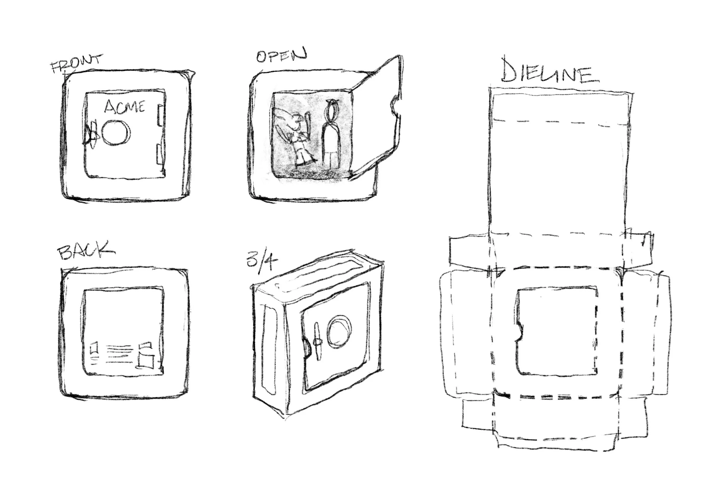
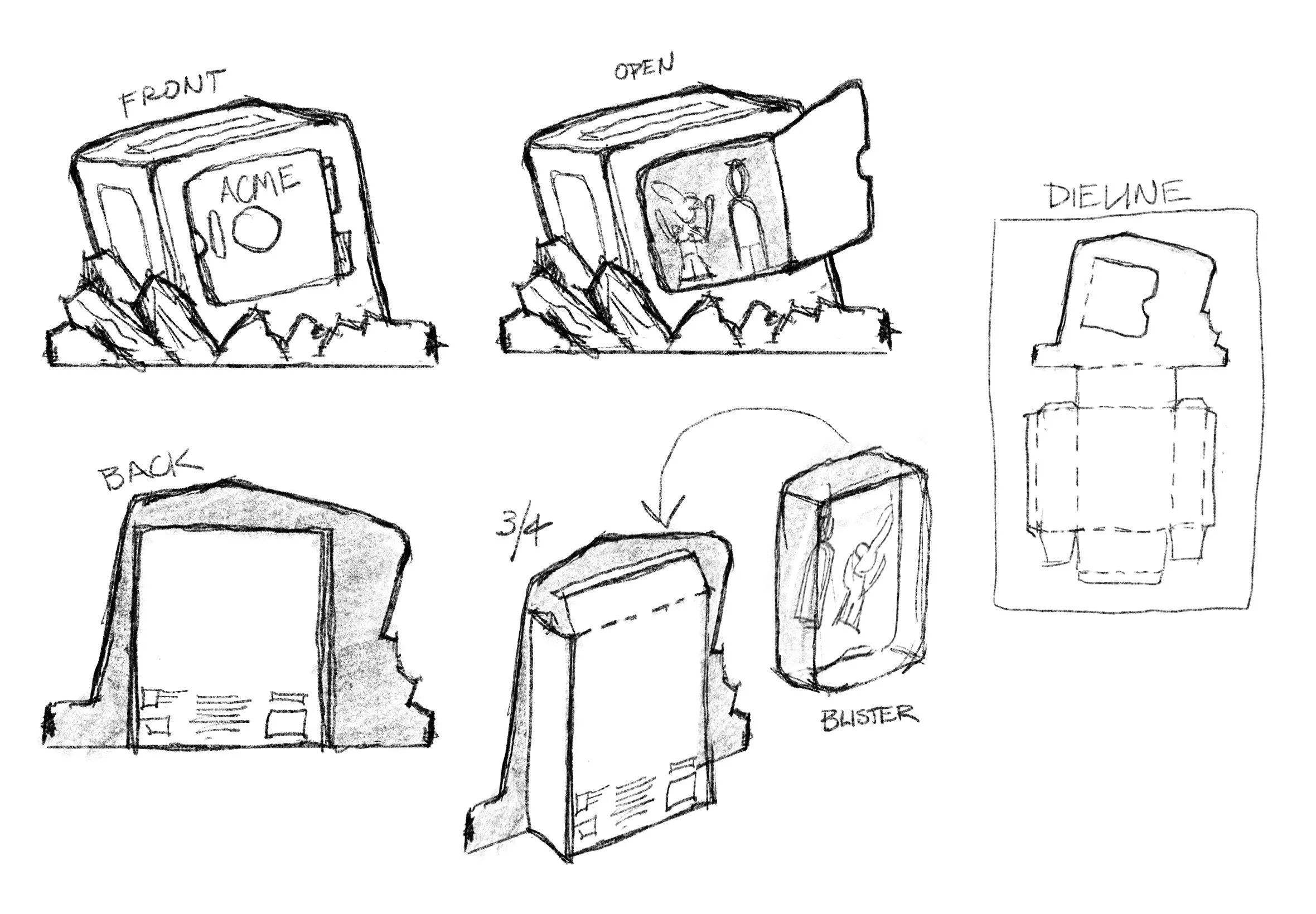
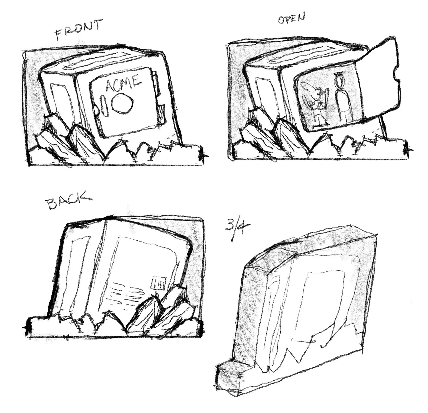
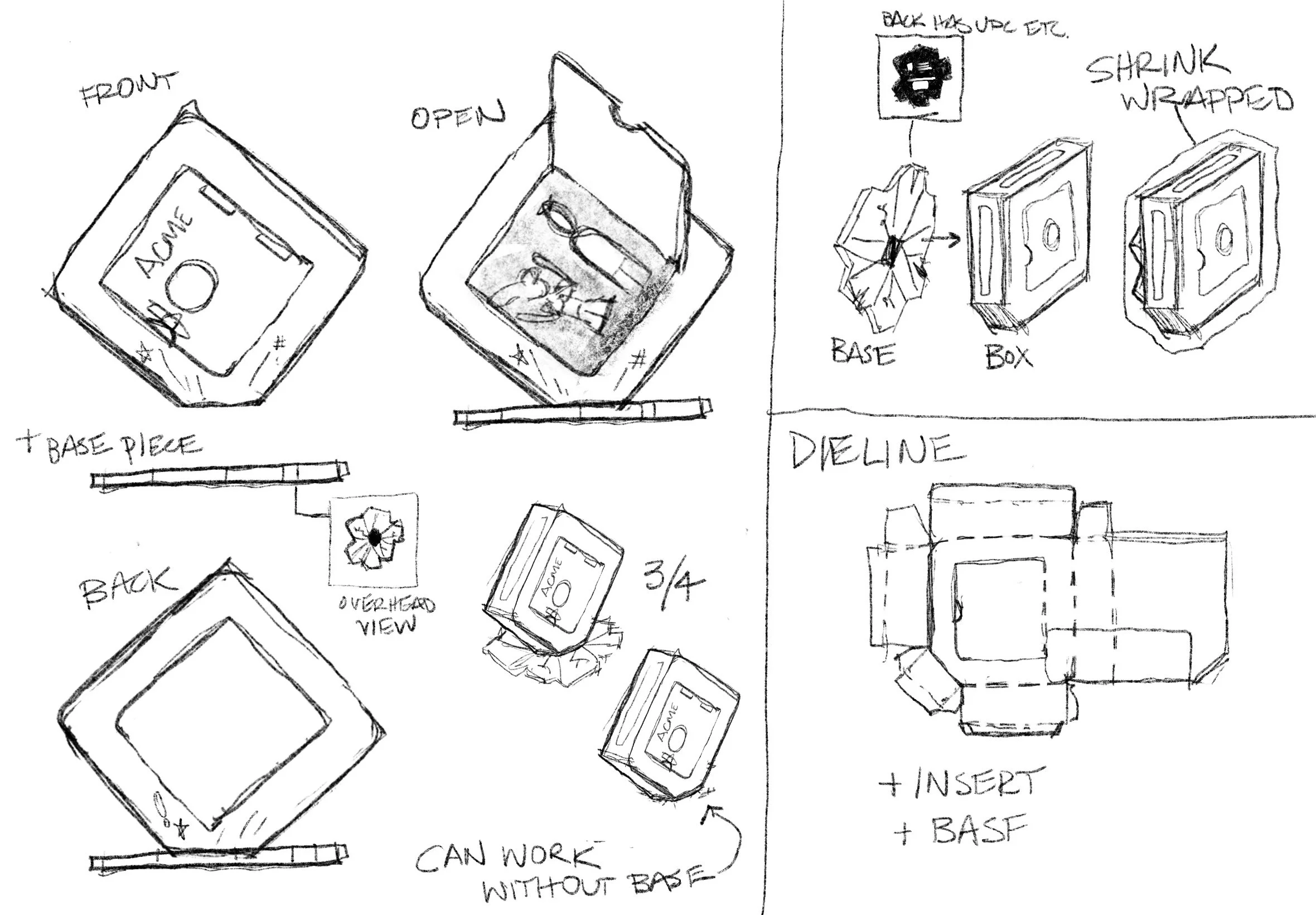
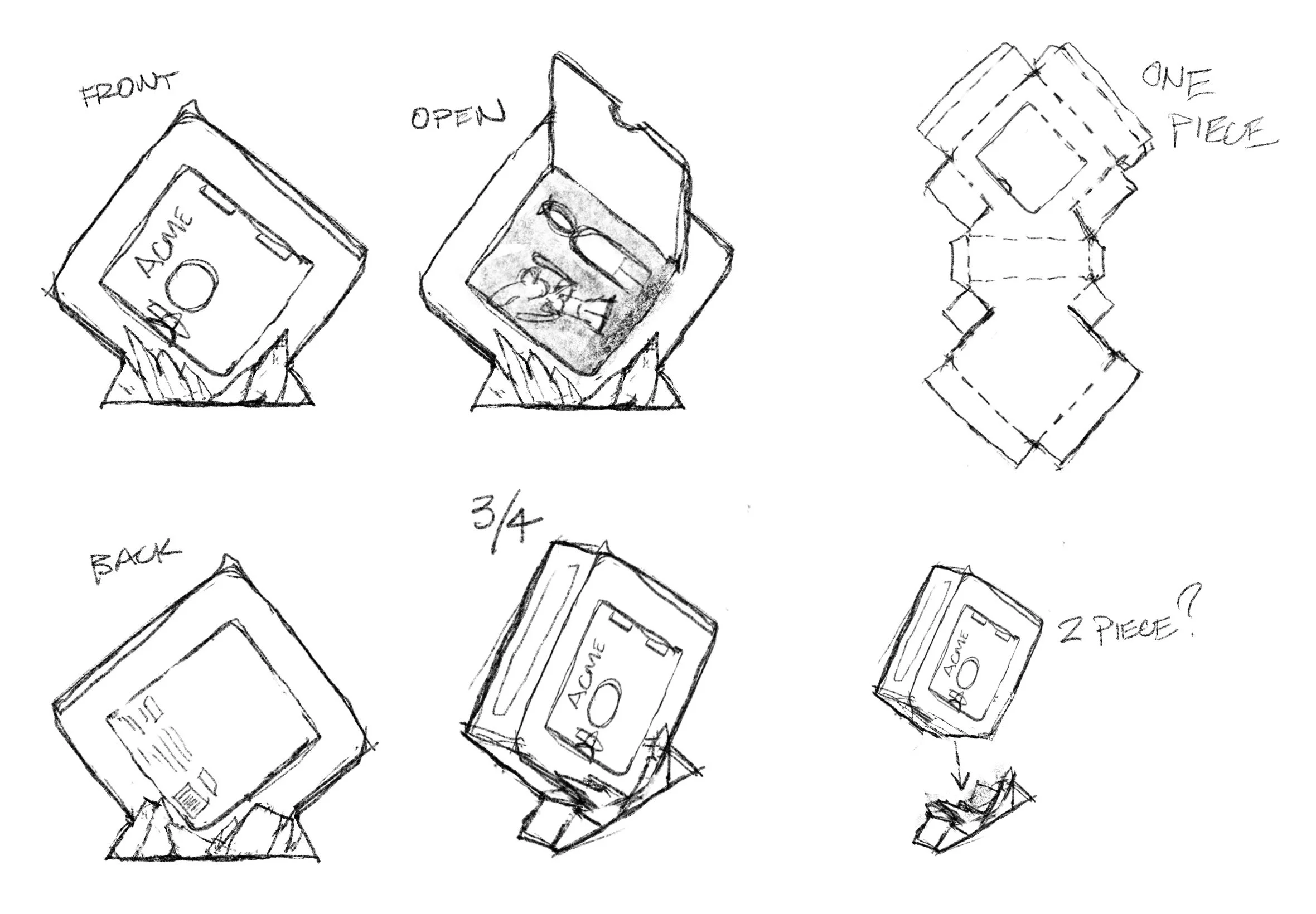
Just like a toon to drop a safe...
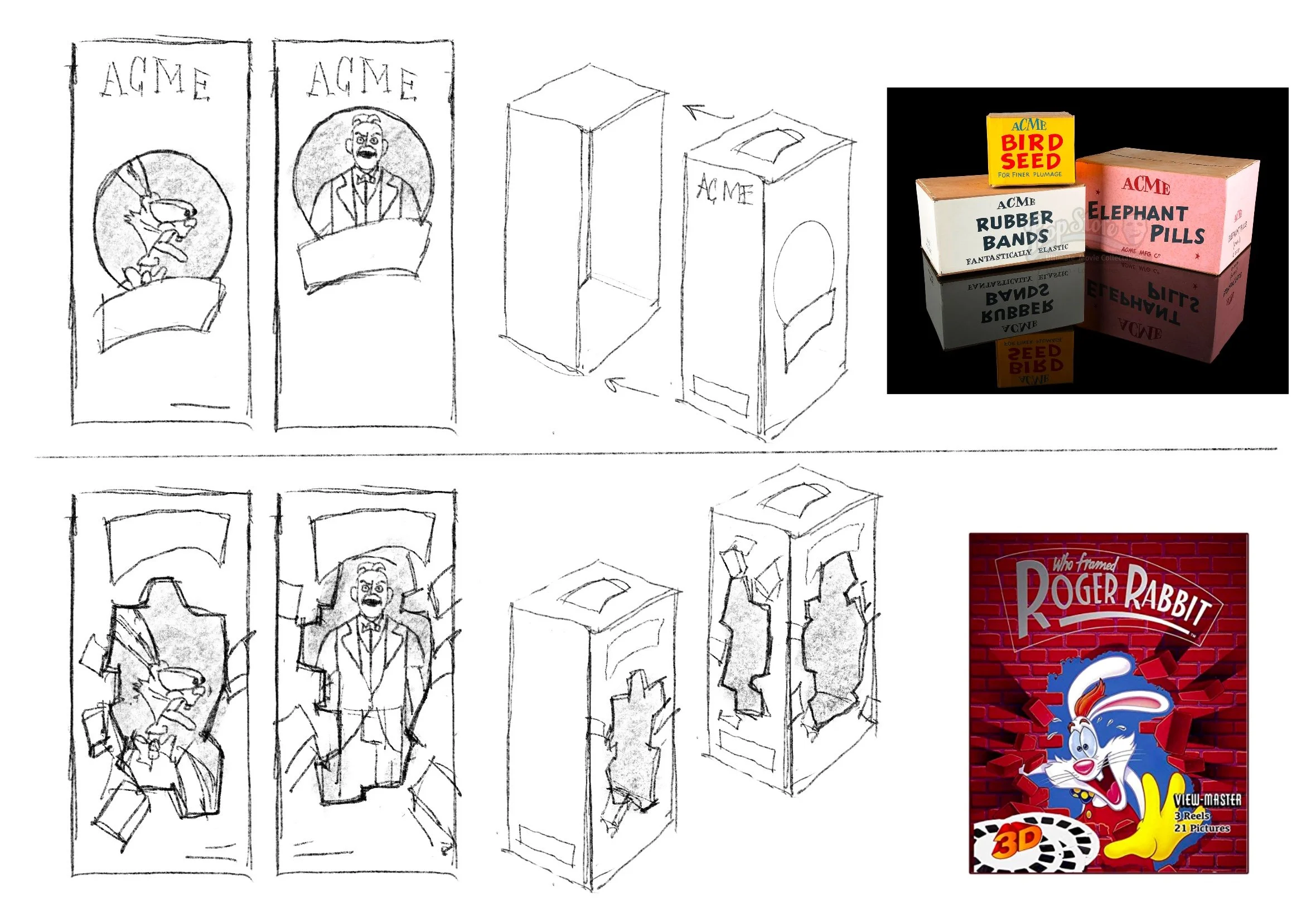
Original concepts for this two-pack packaging were inspired by the typical toon gag of a heavy safe plummeting to the ground. Multiple explorations were considered, from a simple “safe” to options incorporating destroyed floorboards and other display additions.
My god, it'll be beautiful
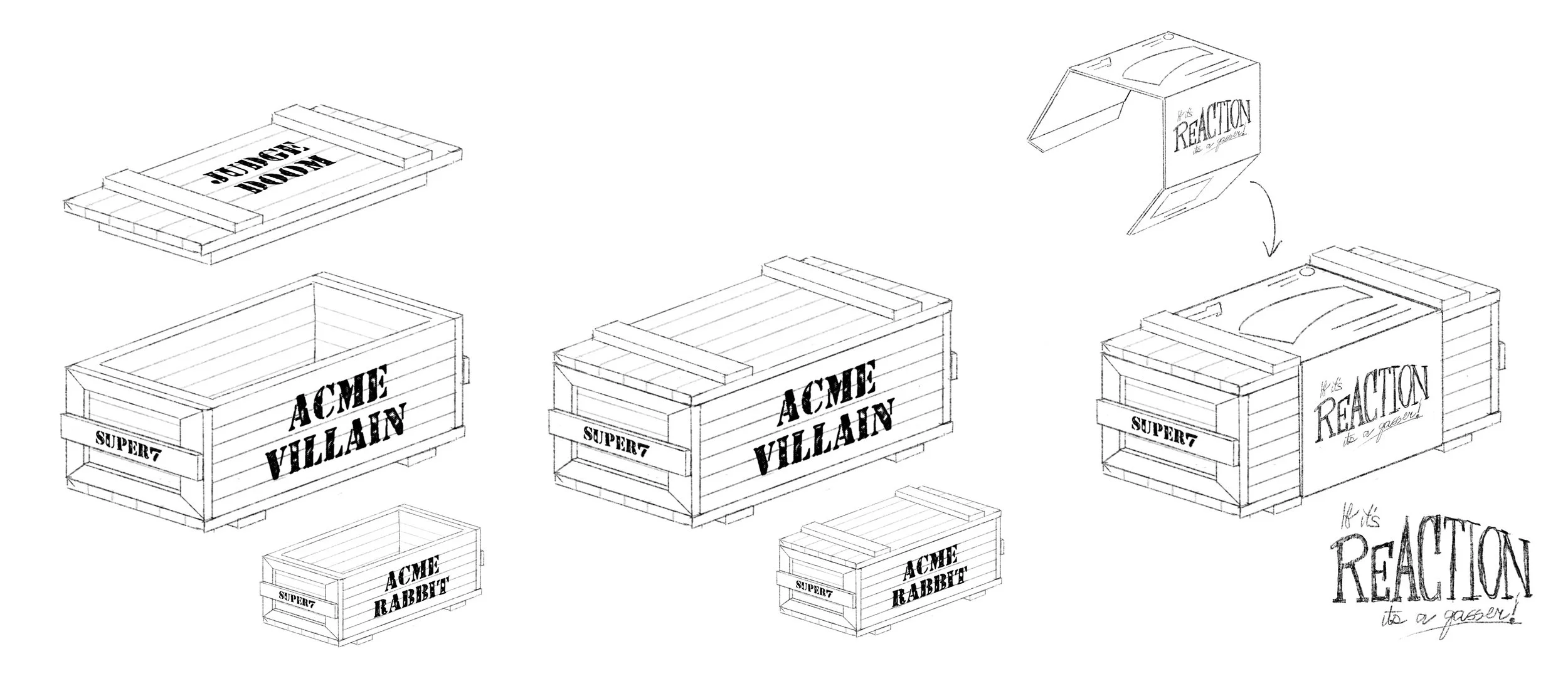
The most expensive option that I explored took inspiration from the ACME warehouse and the variety of crates stored within it. This packaging featured a wooden construction and a printed sleeve to secure the lid.

Every Joe loves Toontown.
Additional sleeved box concepts were considered, with one concept revolving around the ACME warehouse itself, while another drew inspiration from the film's climax.
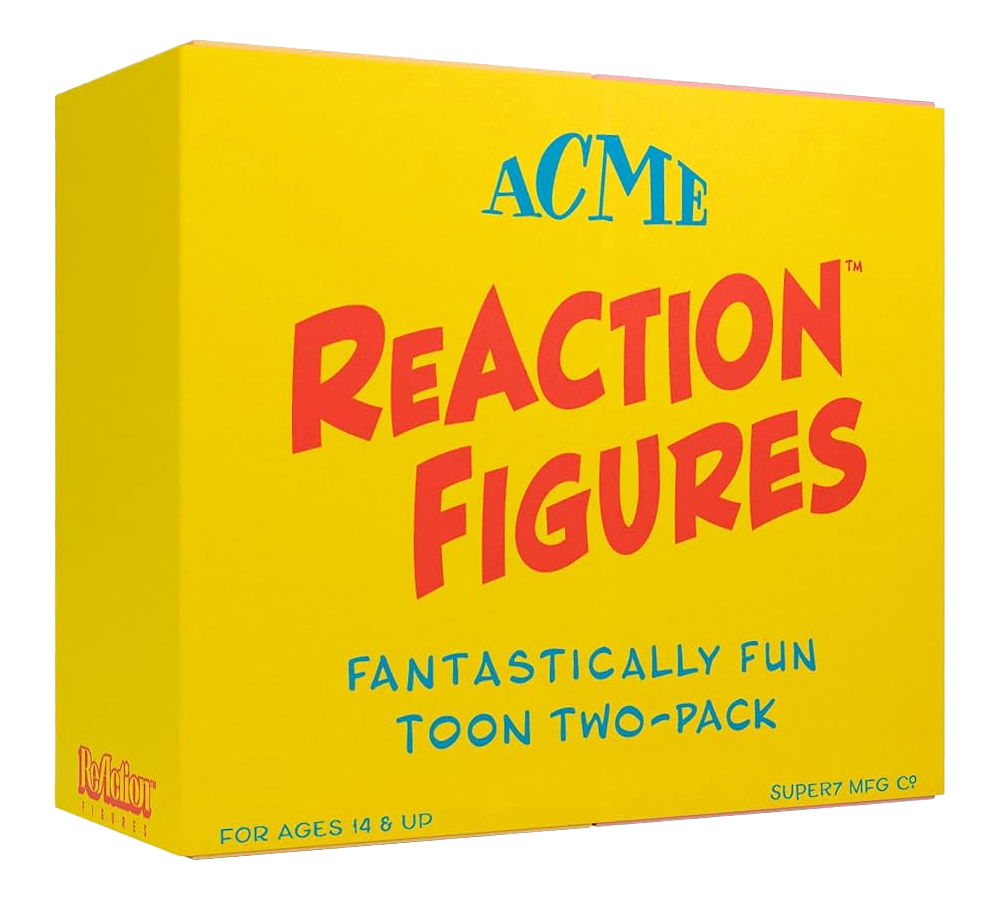
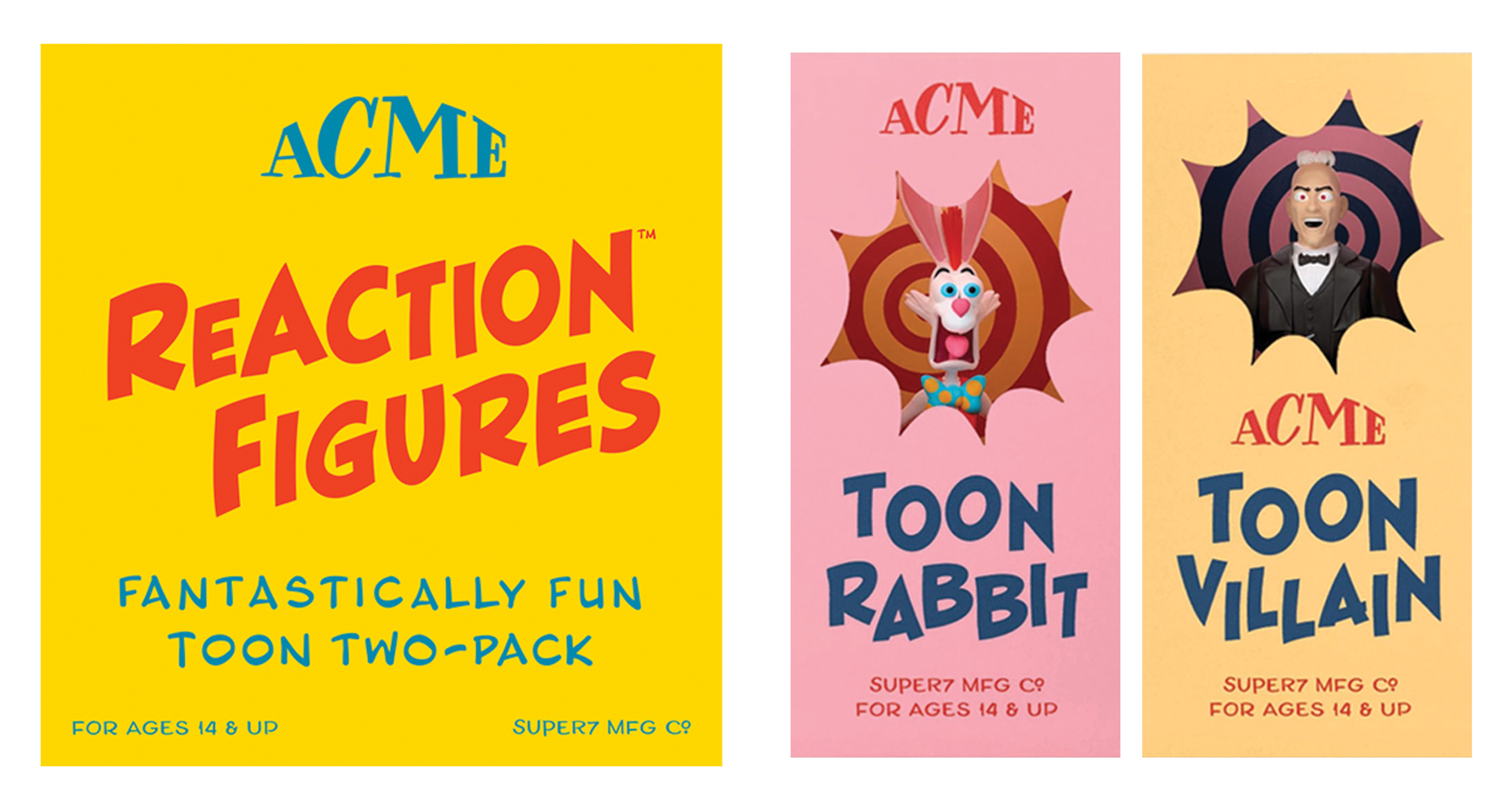
Harebrained Hilarity!
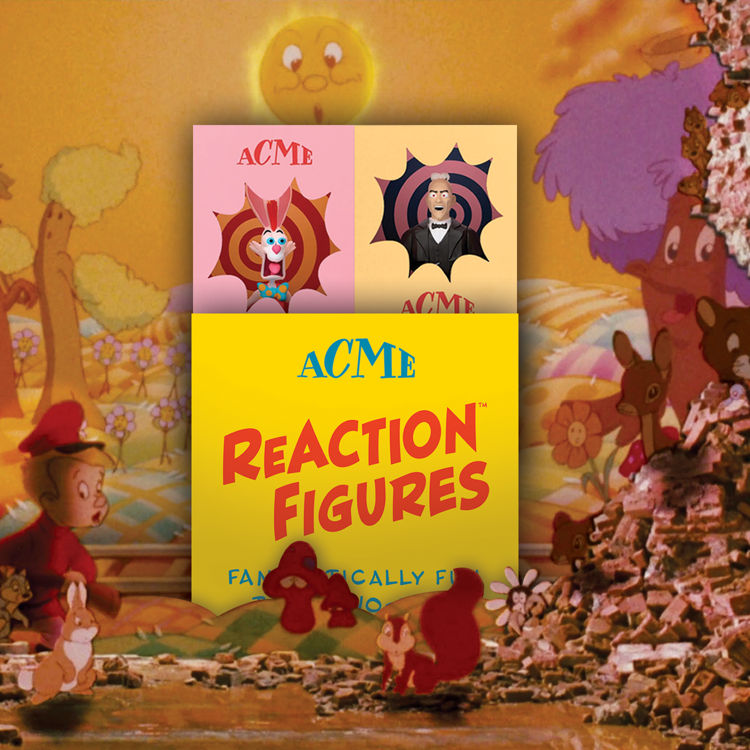
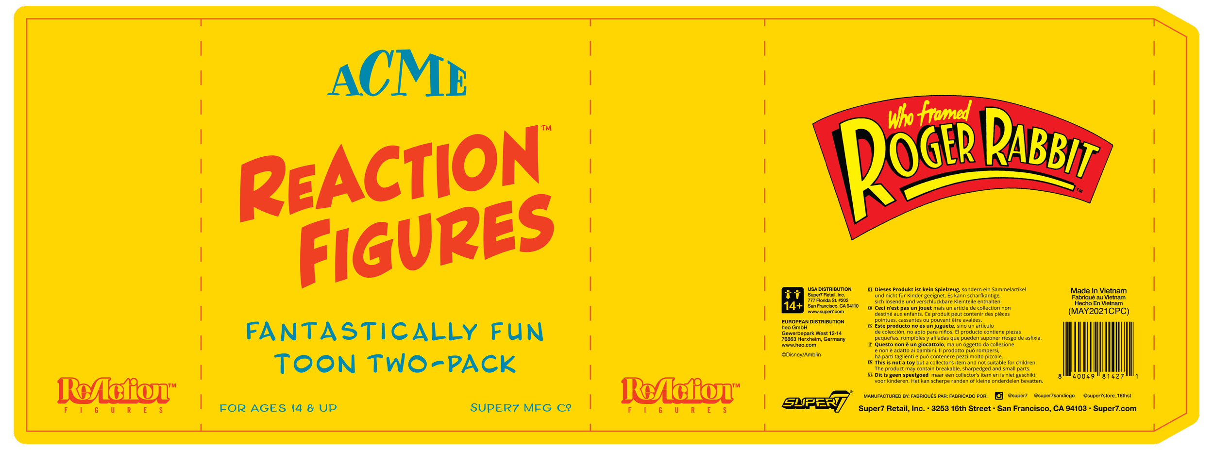
In the end, between production constraints and other factors, the first concept shown here became the basis for the final product. Taking inspiration from the gag products that can be seen inside the warehouse, I constructed similarly styled boxes for the figures to sit in, all held together by a sleeve.
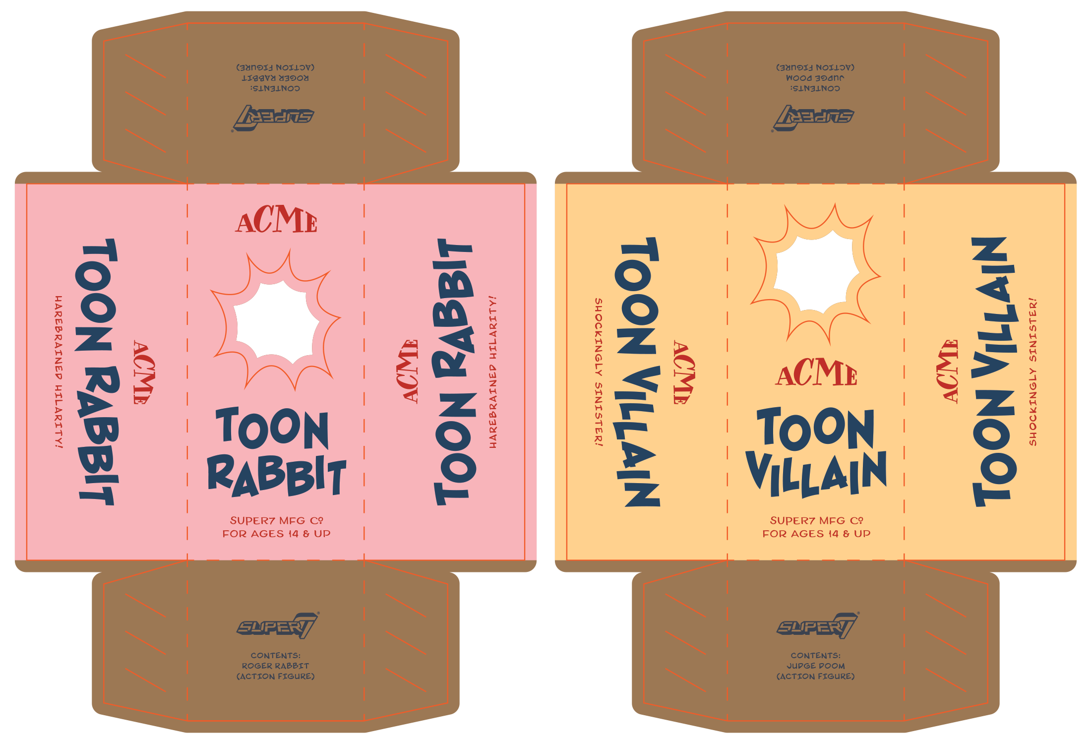
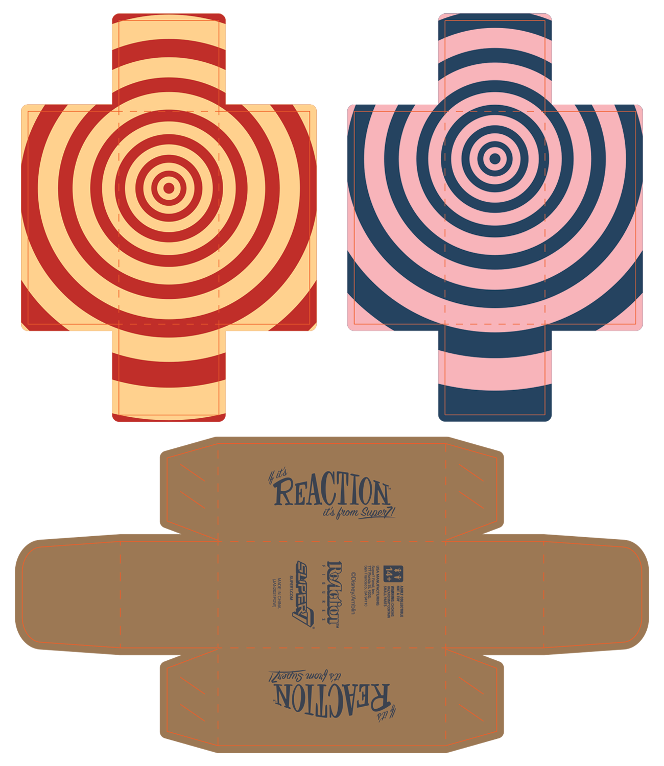
If It's ACME...
The inside of each box was accented by a brightly colored bullseye pattern to drive home the toon feel, while the type placed on the sides is a flip of ACME corporation’s motto, “If it’s ACME, it’s a gasser!”